Over a 20 year period from 1992 some 3600 different designs of mobile phones emerged. Only a handful were outstanding industrial designs. Showcasing the best … here
TABLE OF CONTENTS
PART 1 – TOUR OF THE GREAT DESIGN COLLECTIONS
PART 2 – GREAT INDUSTRIAL DESIGNS CLOSE-UP
PART 1 – TOUR OF THE GREAT DESIGN COLLECTIONS
i. Introduction
The wide adoption of GSM enabled huge global scale economies. Over the 20 years, following the launch of GSM in 1992, some 3600 different designs of mobile phones emerged. From the outset of GSM, the mobile phones were in a race to be smaller, lighter and with longer battery life. That and price were all that mattered.
Around 1999 a number of mobile companies tried to break out of this function led design straitjacket. A rich culture of industrial design blossomed over the following decade (2000-2010). Some outstanding industrial designs emerged. What is equally remarkable for such a huge number of different models is that only 50 or so stand out for their design excellence. The mobile phones that reached the dizzy heights of notable industrial designs, design excellence and works of art are showcased here. Which one would you choose as the greatest mobile industrial design of all time?
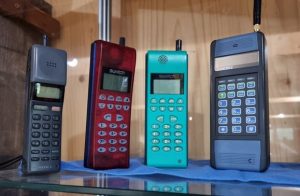
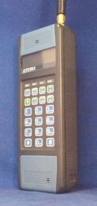
ii. Analogue Collection – A section reflecting the preceding 15 years is a useful place to start as it show just how few mobile phones there were that broke free from the norm of being “bricks” and black.
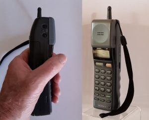
The Sony Mars Bar (shown on the left) is the stand out design from the analogue phone period.
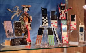
iii. Japanese Collection – Japan was a “technology island” as one of the few countries that did not adopt the GSM technology standard. It was nevertheless a “Treasure Island” of great industrial designs that sadly few people outside of Japan ever saw.
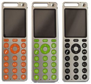
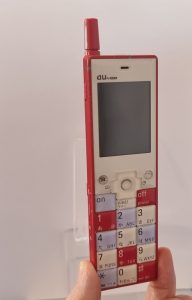
The Au Infobar (second from left in the front row) and Au Talby (shown third from left with the green or orange keys) are the two stand-out designs from the Japanese collection.
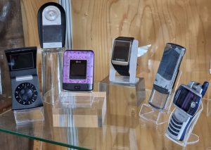
iv. Korean Collection – Unlike Japan, the best contribution to mobile industrial design from Korea have been enjoyed internationally.
The LG Lotus (third from left) is the stand-out design coming out of Korea.
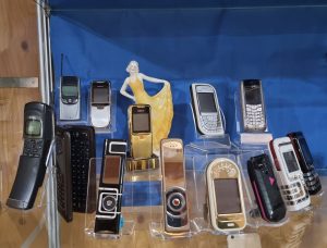
vi Nokia Collection
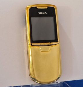
It is said that copying is a form of flattery – the premium versions of the Nokia 8800 (the mobile to the left of the figurine) and its various premium versions are probably the most “faked” mobile phone designs of all time, although faked Vertu mobiles probably run a close second.
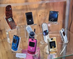
v. Motorola Collection
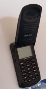
Motorola was the dominant global mobile phone suppliers of the analogue age. Their dominance was challenged by the rise of European suppliers on the back of GSM. Motorola rose to the challenge with their Startac mobile design.
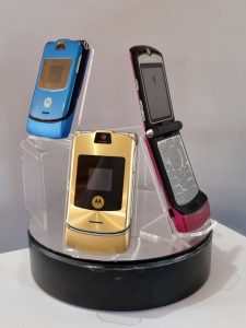
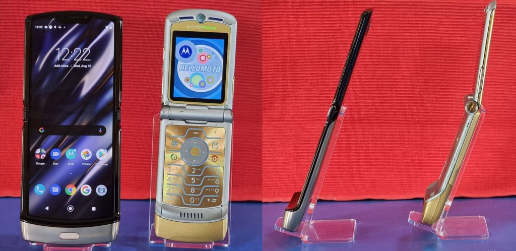
Motorola were no one trick pony. Their design team pulled off an even more stunning industrial design success – the Motorola Razr (four phones at the front).
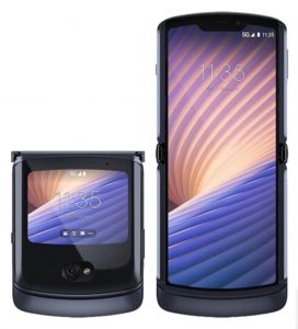
The mobile at the top right is a the Motorola Razr foldable mobile introduced in 2020 as a homage to the original outstanding Razr design.
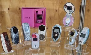
vii Siemens Collection – Siemens is the big surprise. For a company best known for the sort of heavy engineering where the word “beautiful” doesn’t easily spring to mind, they had an exceptionally creative industrial design team.
The Siemen’s SL55 (shown still in its box) is the stand-out design from Siemens
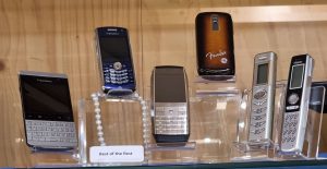
viii Iconic Collection (Best of the Rest) – Here are among the best examples from other companies who made a contribution to industrial design excellence.
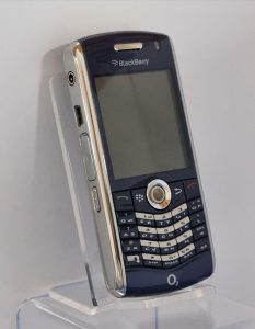
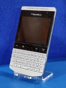
It is perhaps not a coincident that Research in Motion (RIM), the global pioneer in mobile “push email”, were foremost in great keyboard design. The Blackberry Porsche Design and Blackberry Pearl are the two mobiles from the left.
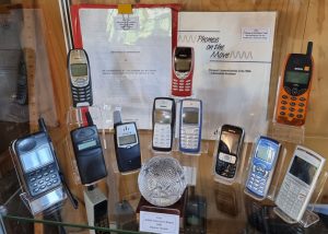
ix GSM collection – This is an area where grouping a number of mobiles of the period adds an extra insight into the struggle the industrial designers had to differentiate the mobile on the basis of its design. It includes two of the top selling mobiles of all time.
The Ericsson T39m (first row, third from left) and the Nokia 6310i (second row left) are the stand out designs from the GSM collection.
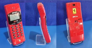
x. Ferrari Branded Collection
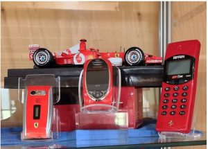
There was a number of link-ups between mobile phone manufacturers and some of the much admired global “brands”. There are a number in the above collections including Dolce and Gabbana with Motorola (Motorola Razr), Bang and Olufsen with Samsung (Serenata and Serene mobiles) and DoCoMo and Q-Pot (Chocolate bars). But the most extensive was between a number of mobile phone manufacturers and Ferrari.
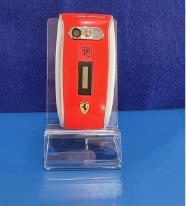
Our collection brings together three notable examples. The Haganuk Ferrari F10 together with its jet black leather case is the outstanding design in the Ferrari collection. The Siemen’s SL55 (centre) has already received a mention in the Siemen’s collection.
xi Apple Collection – When the design brief is to maximise the screen area to its limits there is not much scope left for the industrial designer.
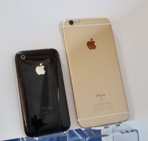
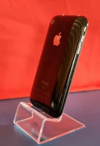
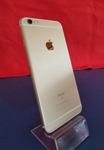
The Apple 6 (right) offers a great viewing screen but the Apple 3G (left) is more comfortable to hold as a mobile telephone – the divergent design pressures foldable screens may help to solve in due time.
It may seem out of place to include two smartphones in an historical piece on great mobile phone designs. But it completes the story, as the rise of the smartphone was the driving force that led to the sun setting on a golden age of mobile phone design.
Footnote: Super-expensive “Bling phones”
The fact of a mobile costing a fortune by gluing precious stones to it casing does not qualify it as “a great design”. Unlike the most expensive cars, none of these ultra expensive mobiles were better either functionally or technically. A Swiss jewellery company once claimed to have produced the most expensive mobile in the world. It looked like the Sultan’s slipper, exceedingly ugly and who would ever want to hold a Sultan’s slipper to their ear to make a phone call? The hero mobile phones, in the league of outstanding industrial designs, were the mobiles that people aspired to own, hold and use and at least the middle class could (in some cases just about) afford, like the Motorola Razr, Au Talby, Siemens SL55, Nokia 8800, Samsung S9110 watchphone and LG Lotus.
PART 2 – GREAT INDUSTRIAL DESIGNS CLOSE-UP
1. Introduction
The sections that follow now focus on the individual mobile phones under each “collection”. Enjoy!
2. Analogue Collection
Technophone EXCELL PC105T
Description: An analogue TACS mobile from 1986
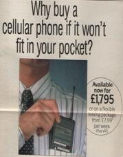
Technophone’s dream was to transform the large, clunky” brick” into the world’s first mobile phone to fit into the pocket. They secured a DTI R&D grant, brought as much computer technology into the mobile phone as the state of the art would allow (including soft keys) and the PC105T arrived on the market in 1986 with a price tag of £1990.
The mobile phone actually did fit into a Marks & Spenser shirt top pocket:
The first mobile phone to fit into a pocket…notwithstanding the antenna
It’s great industrial design achievement was to have changed the form factor of mobile phones. Technophone was one of the first to realise that “thinness” was the key for an item that is to be body worn. It introduced colour. It trail blazed soft keys. The areas of blue at the top and bottom made it distinctive. Rather surprisingly the next iteration of the product (the M2) reverted to black.
Swatch Mobile TCE122
Description: Analogue TACS mobile from 1993
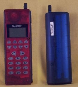
Swatch was one of the first companies to bring both “a brand” and “colour” to the mobile phone. The design created by the Italian designer Fabrizio Galli for Swatch and launched in the UK and Italian analogue TACS markets in 1993. At the time Fabrizio Galli was studying under Mario Bellini the world-renowned Milan architect and designer.
A design first is the curved back making it more comfortable to clutch in the hand than some of its contemporary “bricks”. The see-through plastic allowed a view of the electronic innards revealing perhaps the watch makers influence, although less fascinating than the moving parts of a watch. The mobile electronic innards were Nokia but the outside was pure Swatch – bold and colourful
The mobile sold better in Italy than the UK but by1993 GSM mobiles were in the ascendancy – so its sales life-span was relatively brief.
Sony CM-R333
Description: An analogue TACS mobile from 1992 (popularly known as the Mars bar phone)
The Sony “Mars bar” entered the market in the very year the first GSM hand portable appeared (the Motorola 3200 “brick”). The Sony mobile was cheaper, smaller, lighter, the battery lasted longer and it was the “must have” phone of the time. It showed just what a huge mountain the GSM technology mobile phone had to climb in 1992.
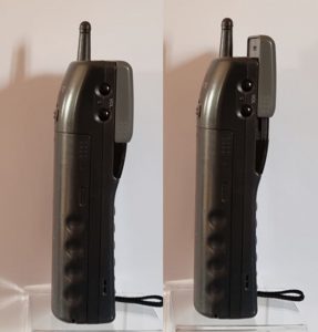
The Sony CM-333 was designed to sit really comfortably in the palm of the hand. The top was shaped to snugly fit the ear. Its neatest feature is how the ear piece shaped top slid up and down in a nice clicking action to answer or terminate a phone call.
Its shape attracted the name of the Mars Bar phone.
3. “JAPANESE” COLLECTION
For such an industrially advanced country, the Japanese mobile phone market was extraordinarily insular. Much of the technology found its way into the global supply chains but some quite exceptional designs were never seen outside of Japan.
Au Talby
Description: Candy bar CDMA mobile phone from 2004
The Japanese network operator KDDI set out to create a reputation for offering outstanding designs of mobile phones. The “Talby” was the third in a series in this mobile design project in which some of the world’s leading designers were invited to create something special.
The Talby – A huge success in Japan
The designer was Australian born Marc Newson and the phone was manufactured by Sanyo. The genius of the design was its combination of almost perfect form factor for a phone, futuristic look from its use of brushed aluminium, pop colours for the keys and very comfortable to hold in the hand. One of the mysteries of globalisation is why the design was never licensed outside of Japan, where it almost certainly would have found a market.
Au Infobar
Candy bar CDMA mobile phone from 2003
The “Infobar” is the creative work of Naoto Fukasawa, one of the most famous and influential industrial designers in Japan. Fukasawa’s concept was to breakaway from the homogeneous clamshell mobiles of the period and create a distinctive design unlike any other. The form factor sizes of Infobar has a particular elegance that makes it nice to handle.
It features an angular design where the multicolored buttons run edge-to-edge and interlocked like a jigsaw puzzle. And although it was available in a range of colours, the red, white, and blue “Nishikigoi” scheme (named after a type of Japanese carp) became an instant classic and one most closely associated with this iconic brand. The name “Infobar” was chosen to reflect the coming future when the mobile would become an important information device and not just a telephone.
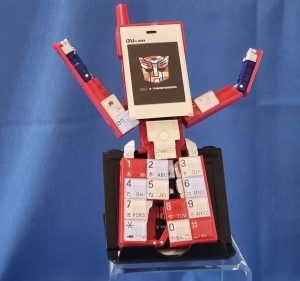
Just how iconic the design has been in Japan is demonstrated by a spin off “transformer” toy that resulted from a collaboration between KDDI and Takara.
Au Infobar II
A candy bar mobile on CDMA2000 from 2007.
A concept model was displayed in the KDDI design studio in October 2006 with a theme of “candy that melts in your mouth”.
Infobar 2
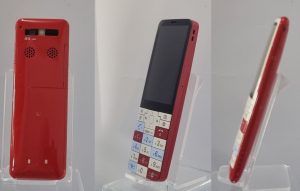
KDDI announced its release in November 2007. The Infobar 2’s design extends the display right against the edge-to-edge keys of its processor, then smooths both halves out to sit flush with the phone’s curved edges. Fukasawa describes the design as “shaped like a square candy that has melted in your mouth and has just started to take on a roundness.”. The curve is intended to make it more comfortable in the hand. It is larger to allow a bigger screen without compromising on a generous size of the keys. On the reverse of the mobile are the stereo speaker outlets providing a better acoustic coupling when held close to the ear for telephone calls.
Au InfoBar XV
Description: 4G Smartphone from 2018
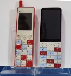
The Au InfoBar XV is an anniversary phone, celebrating a decade and a half since the first Infobar was released in October 2003. The display of the first INFOBAR was about 2.0 inches, and the camera had about 310,000 pixels. Fifteen years later, the INFOBAR xv has the same height as the original INFOBAR and INFOBAR 2, and a body that is not much different in width and thickness to the Infobar II.
Au Infobar I alongside InfoBar XV
The design character of the phone has been skilfully transposed onto a modern device with a 3.1-inch WVGA liquid crystal display and an 8-megapixel camera. Whilst called a “smartphone” it has been configured as a feature phone so as to preserve the signature keyboard.
DoCoMo, Sharp, Q-Pot and chocolate bars
Sharp SH-04B
Description: Limited Edition clamshell 3G feature phone mobile 2009
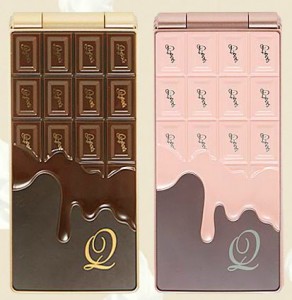
In 2009 the Japan mobile operator DoCoMO caught the design world’s attention introducing a mobile under the theme of “Delicious Communication, Sweet and Melting Chocolate by Q-pot”. Sharp made the mobile in collaboration with Q-Pot and their designer Tadaaki Wakamatsu. The front is a 3-dimentional portrayal of a chocolate bar with or without melted strawberry cream and the reverse has a discrete lightly etched teeth and ghost designs to represent the world of Q-Pot.
At first glance is looks like a tongue-in-cheek bit of fun. But sitting behind is a very clever marketing strategy. Q-Pot have developed a brand around “youth and fun”. It is used to sell fashion accessories. DoCoMo wants to better penetrate the youth market – which the combination of the Q-Pot brand and the chocolate bar novelty achieved.
Weaving a successful brand story around a new mobile
The mobile had an 8MP camera on the outside with image stabilisation, face recognition and smile detection. When the clamshell is opened the interior styling is more conventional with a lower resolution camera. The plan was a limited edition run of 13,000 and two versions called “Melty Strawberry” and “Bitter Chocolate”.
Sharp SH-04C
Description: Clamshell 3G feature phone mobile from 2010
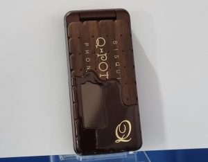
This is the next model from the DoCoMo, Q Pot Sharp collaboration with the theme “Sweet Communication. Nostalgic Biscuit by Q-pot.”
Nostalgic Biscuit by Q-Pot
Q-pot’s own description is: “a unique mobile designed so that it looks like a tasteful biscuit with melting cream, but furthermore feeling crunchy by touching it. It therefore gives a feeling of nostalgia and warmth. You can feel the delight and happiness when holding this cell phone designed by Tadaaki Wakamatsu Q-pot designer. The Q-pot brand is more prominent and the design more biscuit than chocolate bar. The plan was a limited edition run of 30,000 in two main colours of chocolate and cream. The mobile arrives in a box looking like a biscuit box and includes a desktop holder with chocolate or cream motif.
J-Phone SH-04 – The world’s first cellular mobile camera phone
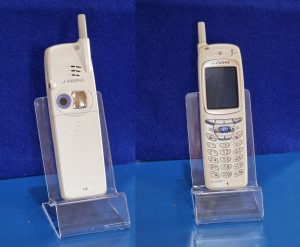
Description: World’s first camera mobile phone on the Japanese J-phone network from 2000
This was one of the significant mile-stones in mobile design, as it had a feature that every mobile and smartphone would eventually copy – a camera lens on the rear of the phone.
There were two versions of the first Sharp camera phone put on the market in 2000, the J-SH04 and the rarer J-SH04s. The hardware was identical.
The phone came in three colours: white, silver and blue. The camera phone shown is the less common white version. To the right of the lens is a curved mirrored surface.
4. “KOREAN COLLECTION
Samsung SGH-F310 Serenata
Description: Music focused GSM feature/fashion phone from 2007
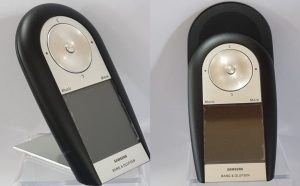
Distinctive styling from a collaboration between B&O and Samsung and designed by David Lewis. The mobile had its own hinged stand and the speakers exposed by sliding up the back.
The sound quality is said to be excellent. It has no keypad but instead had Bang and Olufsen’s clickwheel and a touchscreen. The first mobile with integrated MP3 player appeared in 2000. Had the phone appeared one or two years later it may have been a hit. But appearing in the same year as the Apple iPhone left it as an also-ran. In fact is was ranked as a runner up in Wallpaper’s 2008 Design Awards, losing to the first iPhone.
Bang & Olufsen Samsung Serene
Description: Iconic fashion GSM mobile from 2005
The collaboration was intended to draw on the design strengths of Bang & Olufsen to produce an “iconic” mobile phone for the premium market.
Bang & Olufsen (Samsung) Serene – Work of Art Scandinavian style
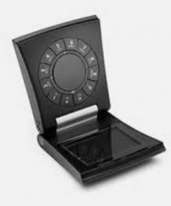
The phone consists of two halves on an aluminium hinge with an internal power assist motor to help open the phone completely. The screen is at the bottom and the keypad is on the half that flips out to improve the weight balance while holding the phone but the phone can be held the other way up. It is one of the great stand-out phones of the period in terms of catching the eye with its form factor and industrially simplistic design that is one of the design hallmarks of B&O.
Samsung S9110 watchphone
Description: GSM mobile phone built into a wristwatch from 2008
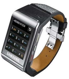
Samsung announced the wristwatch phone as early as 2003. It was going to be the first smartwatch in the world, but Samsung cancelled it. Six years later, the S9110 was released and heralded as the first smartwatch in the world.
LG brought out their LG910 watchphone a year later but the S9110 had stolen the show.
LG LX600 Lotus
Description: Square clamshell CDMS fashion phone with compact full QWERTY keyboard from 2008
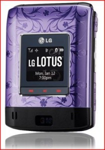
The LG Lotus (LX600) combined stylish design and colour to allow Sprint Nextel to better address the female market segment. It is one of the most exquisite fashion phones of its period.
LG Lotus – Colour and design making something exceptional
In a joint marketing endeavour with LG the US fashion designer Christian Siriano designed a limited edition scarf (described by one commentator as “billowy”) with a pocket specifically to accommodate the LG Lotus. In the same fashion show the mobile was to be seen half out of a pocket in a chocolate coloured vest on the catwalk. The mobile is likely to be remembered for much longer than the Siriano scarf. The LG Lotus is one of the rare mobile phones that could lay claim to being a thing of beauty.
Samsung Z130
Description: GSM/UMTS feature phone from 2005
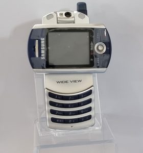
A number of mobiles with swivel screens came out in this period. The Samsung Z130 makes it even look stylish. Two years later the Apple iPhone emerged with the picture auto-rotate feature sending the mechanical rotating screen into museum collections.
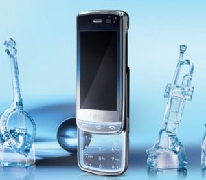
LG GD900 “Crystal”
Description: 3G slider mobile with key pad etched onto glass from 2009
The transparent part of the GD900 is the sliding keypad, which is designed to glow when the mobile is switched on.
5. NOKIA COLLECTION
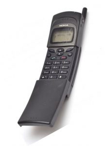
Nokia 8110
Description: Dual band GSM slider mobile with distinctive curved body from 1996
The 8810 was the first in their high end 8000 series and one of the first sliders. Its curved body soon earned itself the popular name “banana phone”. It became one of the most recognisable mobiles when Nokia managed to get a
spring loaded version used in the cult film “The Matrix”. Even without the spring loading the slider was well made and had a good feel to it.
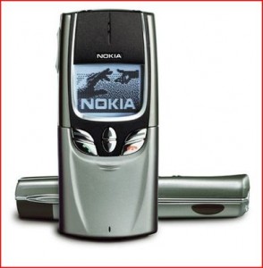
Nokia 8850
Description: Stylish GSM mobile with sliding keypad cover from 1998
In 1995 Frank Nuovo established a Nokia design unit to influence and steer the designs of Nokia mobiles. Nuovo has studied industrial design at the Art Center College of Design in Pasadena and also spent time with the studio Designworks before joining Nokia. The Nokia 8810 was announced in 1998 and represented the arrival of style alongside technology advance as a major influence on new mobiles introduced into the market. This was followed a year later by the Nokia 8850.
Nokia 8850 built to catch the eye rather than dazzle with performance or price
Frank Nuovo went on to head the Vertu project which became Nokia’s luxury phone division. Vertu enhanced the status of mobile phones by positioning them at the luxury and high fashion end of the market.
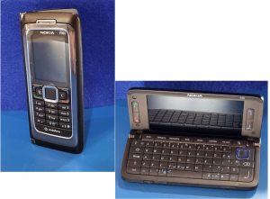
Nokia E60
Description: 3G business candy bar/clamshell mobile hinged to reveal full keyboard and screen. From 2005.
The mobile is one of the last and some say the best of a long line of designs that started in 1996 with the Nokia Communicator. It was “the office in the pocket” to borrow a phrase from the 1989 DTI consultation “Phones on the Move”. The succession of these mobiles had a passionate following.
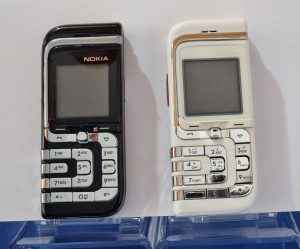
Nokia 7260
Description: Entry level GSM fashion phone from 2004
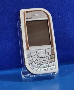
Designers at Nokia headquarters in Finland and a part of their Art Deco collection, with the striking element being the silver contoured lines.
These sleek lines make up the four rows of the keypad and sweep around the edge of the display. While not all of the keys are exactly the same shape, they are roughly the same size. The rows of numbers are separated sufficiently for large fingers to adequately navigate. It was the least expensive of the fashion phones in Nokia’s ‘art deco’ series and the elegance the mobile exuded no doubt played an important role in off-setting its low feature set and camera resolution.
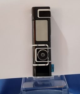
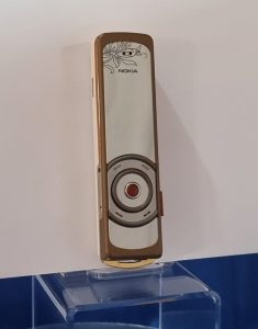
Nokia 7280
Description: GSM fashion phone from 2004
Described as one of the best products of 2004 by Fortune Magazine and an iF product design award in 2005. It has a screen that fades to a mirror when inactive and a Navi-Spinner in the place of a keypad.
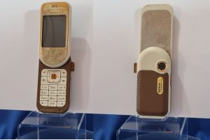
Known popularly as the “lipstick” phone. The Nokia 7280’s input mechanism was designed by Ron Bird but initially for a semi-professional camera Nokia were developing with the code name was ‘Caprice’ that was never brought to market.
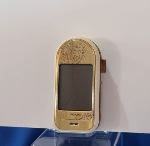
Nokia 7380
Description: GSM fashion phone from 2005
Part of Nokia’s L’Amour Collection. The 7380 was designed at Nokia’s Design Center in California, led by Miki Mehandjiysky.
Has sensory navigation key which functions like the touch-sensitive navigation wheel of the iPod.
Nokia 7370
Description: GSM “swivel” fashion phone from 2005
Part of Nokia’s fashion-focused L’Amour Collection and featuring leather and metallic materials and swivel motion to reveal keypad.
Nokia 7610
Description: GSM fashion phone from 2004
At the time of its launch the 7610 was one of the smallest and lightest dual-band GSM and 3G phones in the world.
It can be seen in design terms as a more thoughtful follow-up to the highly quirky Nokia 7600.
Nokia 7070
Description: GSM low end clamshell fashion phone from 2008
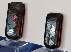
Nokia produced four mobiles in their “Prism” fashion collection: 7070, 7500, 7900 and a luxury version of the 7900 called the Crystal Prism
Very distinctive design made up of a pattern of isosceles triangles to give a prismatic appearance. The aim was to sell the mobile on its looks as it was a fairly basic phone.
Nokia 8800/8801
Description: GSM tri-band Slider with stainless steel body from 2005
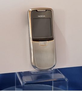
The Nokia 8800 is a luxury mobile phone featuring a stainless-steel housing with a scratch-resistant screen. The sophisticated slide mechanism uses premium ball bearings crafted by the makers of bearings used in high performance cars
The 8801 is the US version of the 8800 that is identical on the outside. The only difference is that the phone operates on the US rather than European GSM bands. Nokia had a very muddled way of numbering their mobile titles. The 8800 arrived seven years later than the 8850.
The mobile has a reassuringly substantial feel to it. It was very well made and projected a cool image.
Nokia produced a series of versions of the 8800 to address the high-end market with the Sirocco in 2006, the Arte in 2007 and Carbon, Gold or Sapphire Arte in 2008.
The price premium attracted a small cottage industry of fakers, although one design-craft company called Olinari produced a very distinctive “customised” 8800 called “King Arthur”. The mobile illustrated above is a fake Carbon Gold sold on Ebay for a price that was too good to be true.
Vertu Ascent
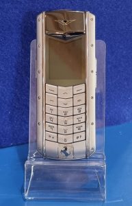
Vertu was Nokia’s luxury phone division. Vertu, more than any other enterprise, has propelled the mobile phone into the luxury goods stratosphere and has dominated this top of the market niche.
By 2015 Vertu had sold 450,000 phones world-wide and dominated the super-luxury mobile phone market. Nokia sold its majority stake in the company in 2012.
6. MOTOROLA COLLECTION
Motorola StarTac
Description: Clamshell mobile produced on a variety of standards (AMPS, CDMA one, TDMA and GSM) from 1996
In the mid-80’s to mid-90’s the dominant mobile manufacturer in the world was Motorola who had a determination to stay on top with a combination of better technology and great industrial design. These two investments were brought together with stunning effect with the StarTac.
Whereas the MicroTAC’s flip folded down from below the keypad, the StarTAC folded up from above the display. A neat consequence was the aerial was pushed away from the head with the lid in between. The device was relatively thin, light and answering a call was made with a gratifying flip upwards of the lid. The lid was contoured on the inside to prove an efficient acoustic coupling to the ear. It was a very clever mobile phone design.
In 2005, PC World named the StarTAC as the 6th Greatest Gadget of the Past 50 Years (out of a list of fifty). The StarTAC was among the first mobile phones to gain widespread consumer adoption; approximately 60 million StarTACs were sold.
Motorola Razr V3
Description: Very slim clamshell GSM mobile phone from 2004
The earlier clamshell mobiles, with a full screen in the lid, had a thickness that made them look inelegant. This led some to take the view that the design was unlikely to catch-on. But it was not a view shared by consumers. Soon the entire market was moving towards clamshell mobiles. When one very senior Vodafone executive in 2003 asked senior people at Nokia why they still had not produced a clamshell design of their own…not a word was said…all eyes looked upwards! The Nokia CEO was one of the sceptics. It was not until late 2003 that Nokia gave way and announced their first clamshell, the Nokia 7200. There was perhaps only 3 months between the Nokia 7200 arriving in the market and Motorola announcing a clamshell mobile that took the world by storm – the Motorola RAZR V3.
The project that led to the Razr began life inside Motorola as a replacement for the StarTac. Right from the outset the Motorola team set “thinness” firmly as a design goal. When it arrived in the market it sent a high voltage shock right across the industry. It’s slimness at 13.9mm was ground breaking for a clamshell. By way of comparison the Nokia 7200 was 26mm thick. In all regards the RAZR V3 was a master-class in industrial design right down to the electroluminescent keypad made from a single metal wafer.
Because of its unique appearance and thin profile, it was initially marketed as an exclusive fashion phone. However, within a year, its price was lowered and as a result, it sold over 50 million units by July 2006 and over 130 million within 4 years. The Razr is one of the all time great industrial design stories.
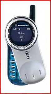
Motorola V70
Description: Swivel GSM fashion phone from 2002
The twister has the same functional purpose as the slider of breaking the mobile into two parts to reduce the length of the mobile when not in use and the same flick of the thumb to produce a working mobile at its maximum length – but by a quite different mechanism.
Motorola V70 adds the twist mechanism to mobile design history
From a marketing viewpoint the importance to Motorola of the V70 was that it looked eye catching and different. It fitted nicely in the just emerging fashion phone market segment. The performance specification of the phone and quality of construction was not great. But that would be put right later with the Motorola Aura.
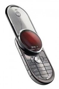
Motorola Aura R1
Description: Swivel luxury GSM mobile from 2008
The Aura brought to their swivel luxury fashion phone an excellence of materials and construction. It had a stainless steel housing, assisted opening blade mechanism with carbon-carbide coated gears, a circular sapphire screen and chemically engraved textures. The swivel mechanism gears are visible through clear back window, an idea no doubt borrowed from the luxury watch makers. The launch price was approximately €1,420 (UK£1,200, over US$2000).
Unlike the Razr before it that began it life prices as a luxury mobile and then brought within reach of a larger market, Motorola never thought to bring the price point down sufficiently. In fact Motorola did the exact opposite. Two Aura special editions styled by luxury designer Alexander Amosu were announced at Mobile World Congress 2009: Diamoniqe Edition with 90 diamonds around the circular display and Gold Edition with 24-carat gold-plated housing. The release later that year of the Aura Diamond Edition with only 34 diamonds and 18 carat gold plating was a strange marketing move. The Aura deserved to be enjoyed by a wider number of customers but remained a very high end luxury premium product.
Motorola Razr Fold
Description: 4G/5G flip smartphone with foldable screen from 2020
Lenovo (who now own Motorola) have reached into Motorola’s great industrial design heritage to become the first to bridge a modern Android phone and the familiar clamshell design of the past.
How well have Motorola captured the magic of this great past industrial triumph?
The picture shows the fold alongside the 2004 Razr V3. It looks an impressive industrial design effort.
7. Siemens Collection
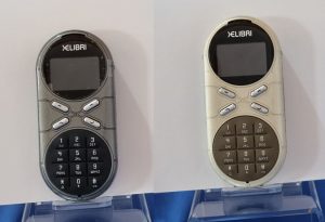
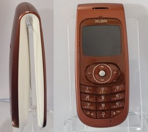
Everybody has heard of Siemens the largest industrial manufacturing conglomerate in Europe. Few would associate the name with design and fashion. Yet for a period Siemens were widely recognised as one of the pioneers and leaders in mobile fashion phones and particularly “wearable” phones. It was their Xelibri series that won for them this recognition.
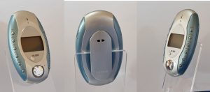
Xelibri “Space on Earth collection”
This series of four phones had a Star Trek theme. They were designed by the in-house Siemens design team. The Xelibri division was headed by George Applin.
Siemens Xelibri 1
Description: GSM fashion phone from 2003
The Xelibri 1 was described as “The Retro-Futuristic Classic” and came in two colours “Champagne” and Smoke.
Siemens Xelibri X2
Description: GSM fashion phone from 2003
The Xelibri 2 was described as “The Alien Beauty” and came in a green they called “Aqua”
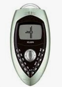
Siemens Xelibri X4
Description: Wearable GSM fashion phone from 2003
The Xelibri 4 was described as “The Dark Hero” in a colour they called “Verdigris”. (The sort of green one sees on on oxidising copper pipes). It was one of the most popular in the Xelibri series.
Xelibri “Fashion Extravaganza” collection
The design for this second series of three mobile was outsourced to the design and consulting company IDEO.
Siemens Xelibri X6
Description: GSM powder compact shaped fashion phone from 2003
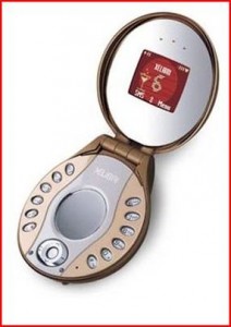
The Xelibri 6 not only looks like a powder compact but when the lid is open it reveals two mirrors (one with magnification) intended to be useful for a lady applying her lipstick.
The buttons positioned around the edge made texting difficult and not the most comfortable phone to hold to the ear. But it is the stand-out design in delivering the shock and awe of eccentric designs. The aspect that most let down the phone as an object of desire was the cheap plastic used for the case and lack of build quality.
Siemens Xelibri X7
Description: Wearable GSM fashion phone from 2003
This appears the most conventional design in the series until it is turned sideways where it is revealed that the phone is a clip. This makes the mobile very wearable in a practical sort of way.
It’s clip slipped very easily and securely over a belt. It was one of the most popular in the Xelibri series.
Siemens Xelibri X8
Description: Wearable GSM fashion phone from 2003
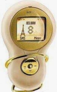
It was intended to be very cool and attract just the right kind of attention. Its curves and smooth edges made it feel good to hold. There is no keyboard, so the user has to scroll through each number via its “navikey”, pressing the centre button when they get to the right one, before moving onto the next. However, it came with a voice-dialling facility that simplified making calls. However, voice recognition did not extend to inputting text which was a drawback in an age of huge SMS popularity.
Siemens SL55
Description: Pebble shaped Slide GSM mobile from 2003
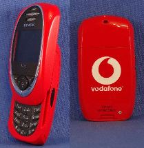
The Siemens SL55 was one of those designs that some people just fell in love with. It was the quintessential small phone, that was good to look at and its rounded shape made nice to hold.
The sliding mechanism worked extremely well. The colours offered were subdued ruby and titan (grey). However, there were a number of limited edition SL55’s produced where much bolder colours made the phone an even more desirable artefact.
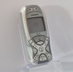
Siemens MC60
Description: GSM mobile from 2003
After a period of functional looking phones from an industry that took no risks on the look of the phone, the need was evident for more risky designs to attract consumers. Siemens were to embrace the change and the Siemens MC60 was one of their first distinctive designs.
The central 5 key could be used as an instant short-cut to access the camera.
8. “ICONIC” COLLECTION
The Best of the Rest
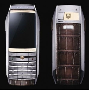
TAGHeuer Meridiist
Description: Super-luxury GSM mobile from 2009
Tag Heuer have been making premium timepieces for the past 150 years and widely recognised for their involvement in elite sport. Their entry into the mobile market at the point of transition from mobile phones to smartphones may not have been ideal timing.
TAGHeuer Meridiist makes hand-craftmanship central to its design
The Meridiist brought a prestigious brand together with an unpretentious design, fine craftsmanship and expensive materials. The unique design feature is a small messaging display in the top of the mobile allowing the user a discrete glance at the time, calling number identity and even incoming messages. The marketing strap line for the Meridiist was “Time in your Hand”. They claim 430 hand-assembled components sitting inside a sturdy stainless steel body with a screen made from 60.5 carat scratch resistant sapphire crystal. The design succeeds as an object of desire in its class.
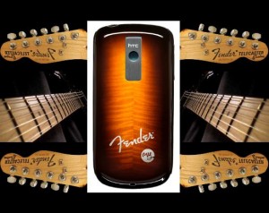
HTC Fender
Description: Limited edition 3G Android smartphone
Fender are extremely highly regarded is the pop music world for their electric guitars and high quality loud-speakers. The HTC showed a lot of marketing sophistication in their collaboration with Fender in 2009 to promote a smartphone directly addressing the youth market.
HTC Fender Edition – Linking the mobile to a leading brand in the pop music industry
The Fender limited edition came in guitar case-like packaging. The outside of “the case” was a kind of a fake leather-vinyl that felt nicer than on many guitar cases. The smartphone came pre-loaded with songs from Avril Lavigne, Brad Paisley, Eric Clapton and Wyclef Jean.
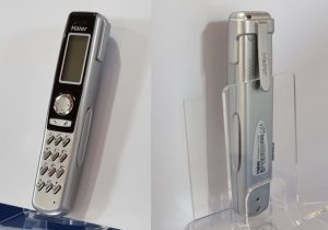
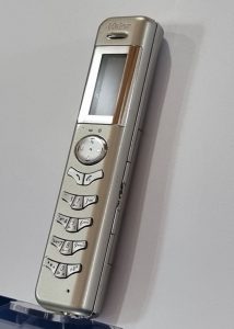
Haier P5
Description: Pen shaped GSM mobile that could clip into a top pocket from 2003
The Haier designers combined into the one device a mobile phone and voice recorder, perhaps inspired by the small voice dictating devices around at the time.
The pen shaped styling made the mobile stand out in a crowded market place of usual designs emerging in this period. It also set out to solve a problem of what to do with the mobile when not in use and that was to clip it on the inside pocket of a jacket alongside the fountain pen. The mobile never had the impact the designers had hope for it but found a small niche looking for something different.
Haier P6
Description: Pen shaped GSM mobile with laser pointer from 2004
Built to look like a voice memo recorder (it had 15 minute recording capacity), its main distinction is a built in class 2 (1mW) laser pointer that only emitted visible light and not harmful unless stared into for any length of time. It looked a handy device for the travelling salesperson having to give demos but it never took off.
Blackberry Pearl
Description: GSM mobile with full qwerty keyboard from 2006
The Pearl was the first BlackBerry with a camera and media player and aimed both at the business market and top end of the consumer market. The stand out design feature of the phone is the elegance of the keyboard.
Blackberry Porsche design p’9981
Description: A high end GSM/3G wide set physical keyboard smartphone
This mobile was all about seeking an outstanding industrial design. Inside was a Blackberry Bold 9900. The major difference was the exterior case, which included a unibody stainless steel frame and leather rear door.
The look of the mobile was totally transformed by the metal QWERTY keyboard laid across in four straight rows that were set into the steel frame. In brand terms the metallic sculptured keys evoked the precision engineering associated with a Porsche car.
9. GSM Collection
The period 1986 to 1996 saw just over 100 different mobile models put onto the market. By the end of this decade the GSM global scale economies kicked-in. This led to over 3600 different models of mobile phones being put onto the market over the decade that followed (1997-2007). Picking ten “representative” mobile phones from such a vast number of models is always going to be a challenge since many people have a great affection for their first mobile phone and it may not have been the one selected.
Eleven representative GSM mobile phones
On the front row from left to right:
Sony CMD Z1 Plus from 1997. The flip microphone boom was Sony’s alternative to the flip lid. The phone weighed 195g and 50 hours of standby power.
Ericsson GF788 from 1997. Designed by Singapore designer Yeo Chung Sun. It came in dark grey, Bordeaux red, dark blue and dark green. Won a German IFDesign Award in Hannover. It weighed 135g and had 60 hours of standby power. The race for smaller phones with longer battery life was still driving the mobile phone design competition.
Ericsson T39m from 2001. It was Eriksson’s last phone with active flip and external antenna. It came in classic blue, Icecap blue and Rose white. At 86g, it was one of the lightest phones on the market at the time.
Nokia 1100 from 2003. One of the world’s top selling mobiles at 250 million. Made of a durable plastic shell with soft, tactile rubber button. It was durable, cheap and the battery lasted over two weeks on standby.
Nokia 1110 from 2005. Another of Nokia’s mobiles aimed at the emerging markets and also hit the 250m sold slot. It is a prettier version of the Nokia 1100 and with more features.
Nokia 2630 from 2007. A candy bar phone that was Nokia’s thinnest at the time at 9.9mm and weighed 66 grams.
Bird S288 from 2003. Called “New Type Slim Phone” is was one of the few distinctively styled mobiles to come out of China.
Samsung X820 from 2006. It was 6.9mm thick and weighed 66g. It was also called the Ultra Edition 6.9 and marketed as the world’s slimmest mobile.
The three elevated mobiles at the very back, from left to right:
Nokia 6310i that was hugely popular in the corporate market. A note came around Vodafone employees in 2003 from the business division asking staff to give back their Nokia 6310i as the corporate customer demand was so high. None could be prized out of the hands of the staff. The design was probably one of the high water marks of the mobile design as “a telephone”.
Nokia 8210. It was announced in 1999 and was the smallest, lightest Nokia mobile at the time. One of its notable features was colourful interchangeable covers. It remained quite popular over the best part of a decade.
Bosch 509e This mobile secured a place in the Museum of Design Plastics for its use of a translucent orange injection moulded polycarbonate.
10. FERRARI BRANDED COLLECTION
Haganuk Ferrari F10
This is an outstanding design that came in a contrasting black leather holder. It has a great visual impact and shape made it nice to hold and use.
Sharp GX25 Ferrari Edition
Siemens SL55 Special Vodafone Edition
This Vodafone special edition has a curious history. There was a period when Vodafone sponsored Farrari (2002-2005) and had a Farrari F1 racing car parked inside the entrance to their corporate HQ at Newbury. This special edition of the SL55 is thought to have been produced exclusively as a corporate gift to Vodafone senior executives.
11. APPLE COLLECTION
Apple iPhone
The first iPhone came out in 2007. It was a GSM based smartphone. The relative low network data speeds was limiting the enormous potential of the device. This was put right the following year with the iPhone 3G.
The iPhone 4 was announced in 2010. The iPhone 5 arrived in 2012 a year after the death of Steve Jobs. By then the “smartphone versus mobile phone” war had been decisively won by the smartphone. The iPhone 6 arrived in 2014.
It was taller, wider and slimmer. The larger screen responded to market demand but the width and square edges made it a less comfortable device to hold compared with the iPhone 3G. Apple claim to have sold 220 million of iPhone 6 and iPhone 6 Plus combined.
12. THE END OF THE MOBILE PHONE ERA
There were many attempts at mobile phones aimed at the super-rich. The best in class promoted a high standard of craftmanship using best quality materials. Vertu claimed this space for nearly a decade.
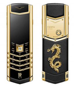
The high water mark of Vertu mobiles design is the “Signature S” and the “finale” they would probably want to be remembered by is the trio of special edition models they launched in 2012 to welcome in the Year of the Dragon with a choice of “stainless steel and emerald”; “black stainless steel and ruby”; or “yellow gold and diamond”. It is probably the year when the curtain finally closed on the era of the mobile telephone. It is the year Nokia sold its stake in Vertu. The smartphone was, by now, in rapid ascent. The rise and rise of the iPhone had been matched by the fall and fall of the mobile telephone and the demise of the rich culture of industrial design it had inspired.
A new design straitjacket gripped the industry. Function took over once more. The largest screen size for a given size of smartphone was now “the king” ruling smartphone design.
